Background:
Tailster connects pet owners to pet carers who provide various services such as dog walking, checking in on pets (sitting), pet daycare and overnight stays (boarding). The service is spread over two apps, the Tailster owner’s (over 10k downloads on Google Play) and Tailster Carer Assistant (over 5k downloads on Google Play) and their website which receives over 1.45k page views per day. The Tailster owner's app is for owners of pets, while the Carer Assistant is for people who provide care services for animals. The app I will be addressing here is the carer assistant on Android version 1.17.1 (latest version as of 24/06/2019), which based on 53 Google Play reviews currently holds an average score of 2.7 stars out of 5, demonstrating significant room for improvement. On Trustpilot out of 215 reviews, Tailster has an average rating of 4 out of 5 stars with 75% of respondents giving it an “Excellent” rating (5 out of 5), showing that it is the app itself that is the cause of issue as opposed to the service itself.
Current UI Description
Home:
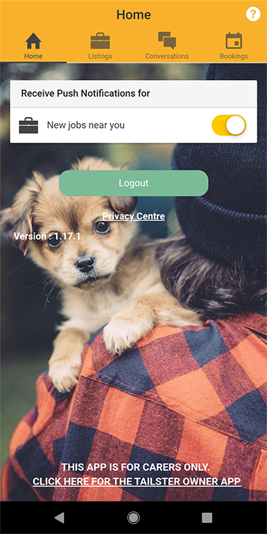
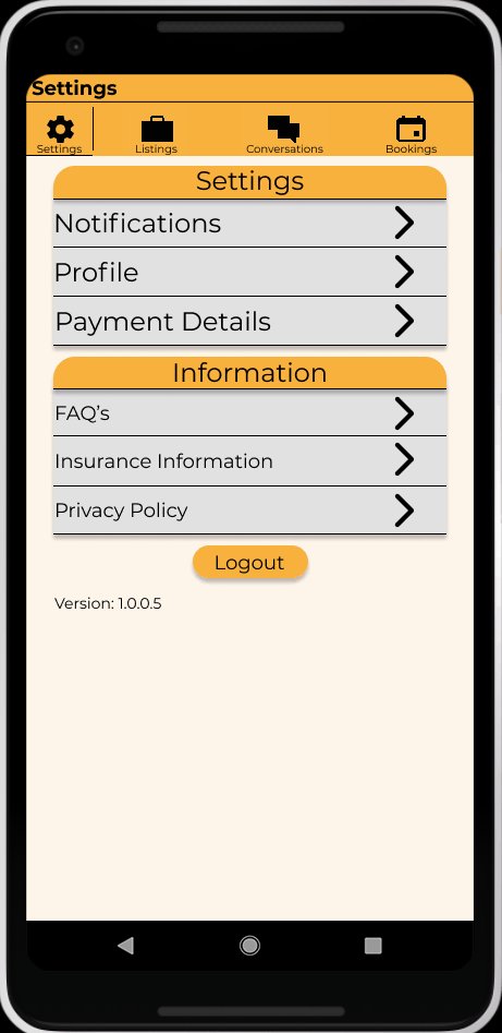
The “Home” tab displays very little useful information, resulting in a lot of unused space, and presumably the reasoning behind incorporating a background picture. There are only 2 user controls; push notifications and logging out, along side 2 links to the website for the privacy policy and attaining the “owner” version of the app. This section could be repurposed to include more useful information and actions for the end user. The question mark icon in the top right hand corner indicates that selecting this would bring up a “help” menu or more information. However this button is inactive and is displayed on all pages except for “Bookings”, making its inclusion not only superfluous but also inconsistent.
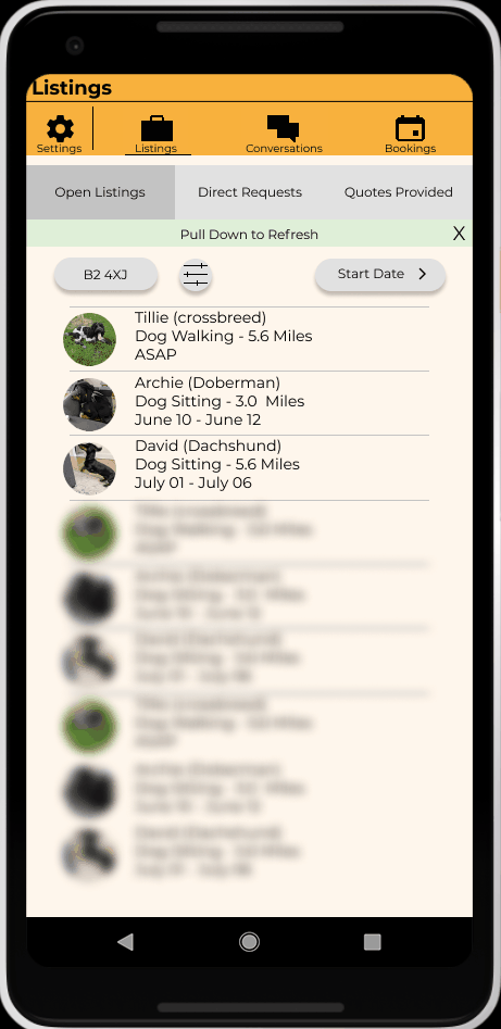
Listings:
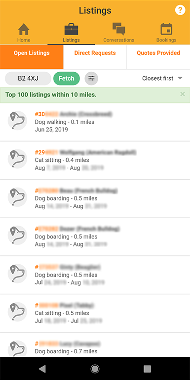
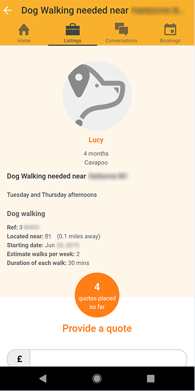
In this section under open listings the user can enter in their post code, refresh the results (through the “fetch” button), set filters and sort by distance or newest. There is a closable message which just states how many messages it is displaying and within what radius – as set by the distance filter.
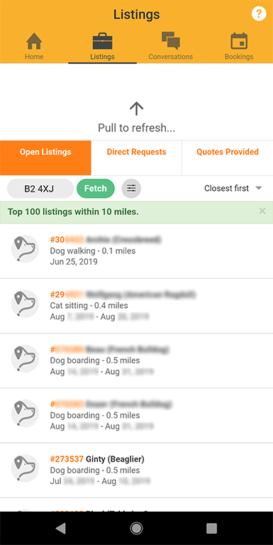
The refresh button is made redundant by the ability to drag the screen down to refresh results.
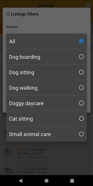
When filtering results, a pop up box appears where the user can select the distance or type of service. However when attempting to change these settings, instead of a drop down menu appearing, a pop up dialogue is displayed, it uses the system theme which if set to dark mode is noticeably incongruent with the rest of the app theme.
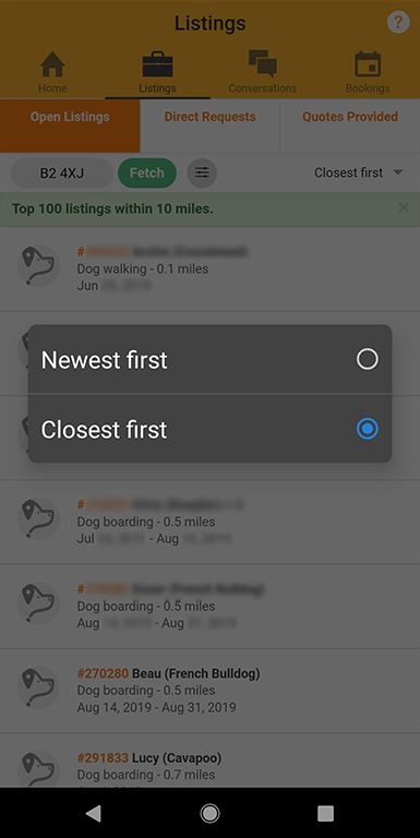
The same issue is demonstrated when sorting the search results between distance and newest.
When selecting a listed advert and then going back: refreshes results, resets filters and sorting order. The back button on the device in either hardware or software does not return the user to the previous page, instead you have to click the white back arrow on the top left of the screen. This issue is persistent across the whole app.
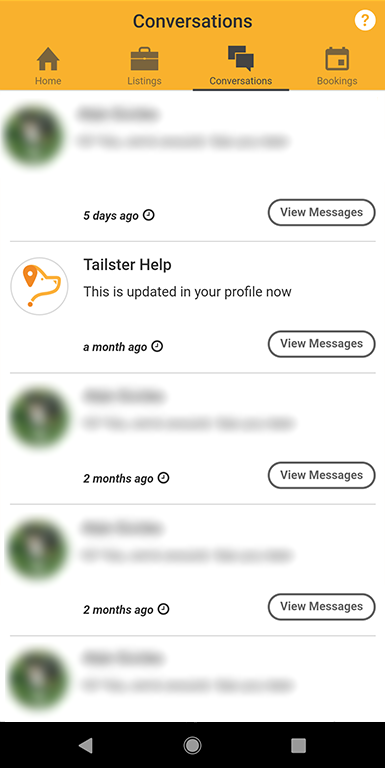
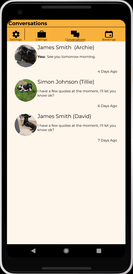
Conversations:
Here previous messages between the owner and career are displayed, it shows the names of the owners and accompanying picture (if provided) of the animal(s) in question.
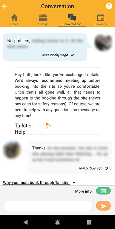
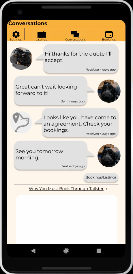
When viewing a conversation with an owner it displays the message along with a time stamp measured in days. From here you are unable to view details of the animal. Within the conversation there is a drop down box titled “Why you must book through Tailster” with relevant information.
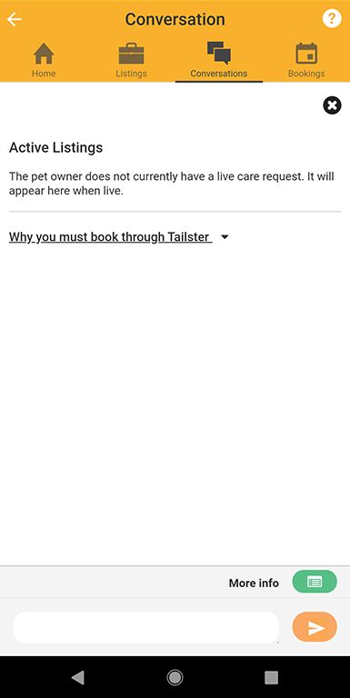
Clicking on “More info” simply displays whether there are any current active listings from the owner.
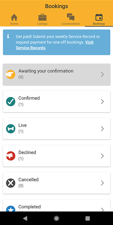
Bookings:
The final tab of the app is for bookings, detailing both active and inactive ones. Displayed here is an information message about submitting service records to get paid, with a link which directs you off of the app and into a browser where you have to login and navigate the site. There is no reason that this could not be incorporated into the app itself.
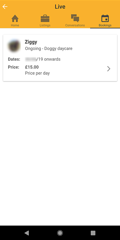
When a user has a live booking it will display the name of the animal as well as brief details of the service being provided and price. Clicking on an active booking you are given the opportunity to get more information about the booking as well as the animal.
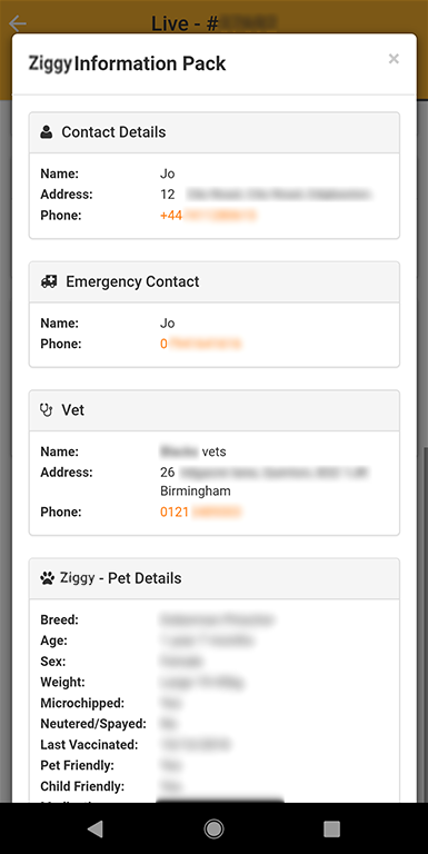
In the animal’s info screen, the contact information is highlighted which indicates that it either copies to clip board or directly opens up the phones default call app. However no such functionality is included (at least within the Android version).
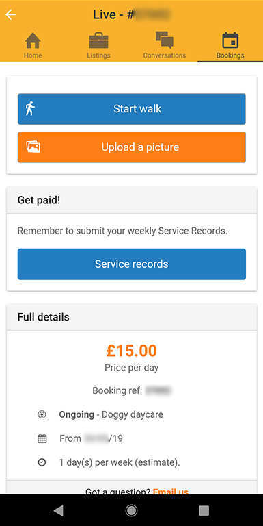
There is the ability to upload 1 picture at a time and send a message, as well as starting a walk. This is then sent to the owner
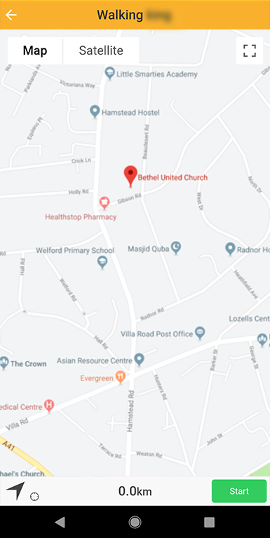
When initiating a walk the app locks in on your location but does not start until the user clicks the start button at the bottom right of the screen. This could easily be overlooked by the user. Once started the map displays where the user has walked and the distance travelled. Once stopped the user can upload the data which sends a message to the owner with the route distance and time travelled.
Identified Issues
- Lack of useful information and user controls on Home tab.
- Superfluous inactive and inconsistent displaying of "help" icon.
- Redundant refresh button on listings.
- Inconsistent UI with pop up dialogue boxes utilising system theme.
- Lack of persistent filters and ordering.
- No way to order listings by "Start date"
- Unable to navigating back to a previous page with hardware or OS software back buttons.
- Unable to view animal details from within conversations.
- No ability to quickly call emergency contacts.
- No support for multiple simultaneous picture uploads.
- Starting a walk requires an additional step which might be missed by the user, as the start button is placed in the lower right corner.
- No incorporation of submitting service records within the app.
- No integrated calendar displaying bookings.
- Unable to edit profile and payment details within the app.
Proposed Solution
Home:
When the user starts the app they are sent straight to the open listings view. When adjusting filters or sorting, instead of bringing up a dialogue box they are now drop down menu’s. Allowing them to be correctly themed to the colour scheme of the app, and are independent to device theme settings.
The refresh button has been removed and instead of a message of little use to the user, the closable banner now states how to refresh the page by pulling down. By having the app require manual refreshing when it is open, should make the use of persistent filters easier to implement in code.
Tapping on the individual listing brings up the details of the advert. Tapping on the accompanying picture of the animal(s) brings up their details in a pop up box for quick review. On this page the personal and emergency contact details can be hidden until both carer and owner have come to an agreement.

Settings:
The settings section has been re-designed to provide more useful content. The user can now toggle on and off notifications not just for when new adverts are posted, but also for upcoming bookings. This will be a useful addition to users who have multiple bookings on the same day, e.g. multiple dog walks as well as animal sittings.
From this settings page the user has the ability to edit their profile from within the app, as the current design requires the user to do so through a browser.
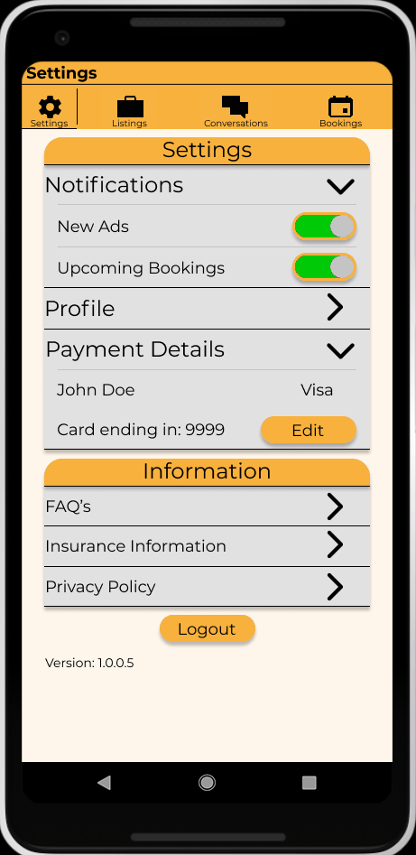
Unlike the current implementation, payment details can also be altered through the app. The displayed information gives the name as well as the last 4 digits on the card, to update or change the payment details requires the user to re-enter their password for security reasons; e.g. in case the phone is stolen, no one can steal the users earnings or gain payment information that could be used for fraud.
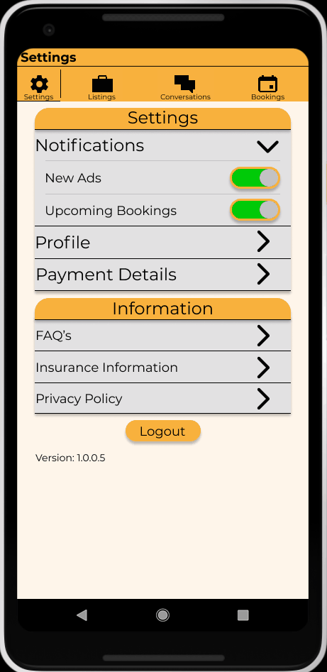
An additional information section has been added within the settings menu, so that the user can quickly reference the: FAQ, insurance and privacy policy information.
Conversation:
Under the conversations tab, to view messages the user just taps on the text of the previously displayed message, as is standard with all modern messaging apps. Doing so allows the user to view the correspondence between the owner and themselves.
Tapping on the animals picture brings up the animal details as well as the owners contact information. This enables the user to be able to check the details either for a current booking, or simply for posterity, and if in an emergency quickly gain the relevant information in a timely manner.
The call icon signifies that tapping it will open the phones default call app. Enabling a quick way to contact either the owner or a veterinary service in the event of an emergency.

Tapping on a booking or listing will send the user to the relevant advert page, enabling the user to look over the specifics; something which the current implementation lacks. There are instances where useful information may be contained within the advert, but not found elsewhere. Having the ability to view the original advert provides the necessary information for the user, without having to directly contact the owner for clarification, saving time and frustration. Linking to the advert also provides the benefit of cross checking how much they have quoted the owner. Although this can be found in other sections of the current implementation, having the ability to navigate to that information here increases the usability of the app.
Bookings:
When under the “Bookings” tab there is a calendar with a key. This gives a quick visualisation of upcoming bookings for the user, displaying accepted as well as pending bookings. The calendar is scrollable to view bookings in the upcoming weeks, and provides the date ranges for what the calendar displays at the top. The navigation is intuitive with the addition of the arrow icons (Note: due to a limitation of the software used for the mock up scrolling by tapping is not possible. To scroll click and drag to move calendar side to side).

From the calendar a user can tap on the respective booking to edit its data such as times, this is useful for the upcoming bookings notification feature (Note: due to a limitation of the software used for the mock up tapping on a scrollable area to bring up a new window is not possible). Any changes to date will be prompted with a confirmation box that states that changes will have to be agreed with the owner, and a notification is sent to them upon the user going forward with the date modifications.
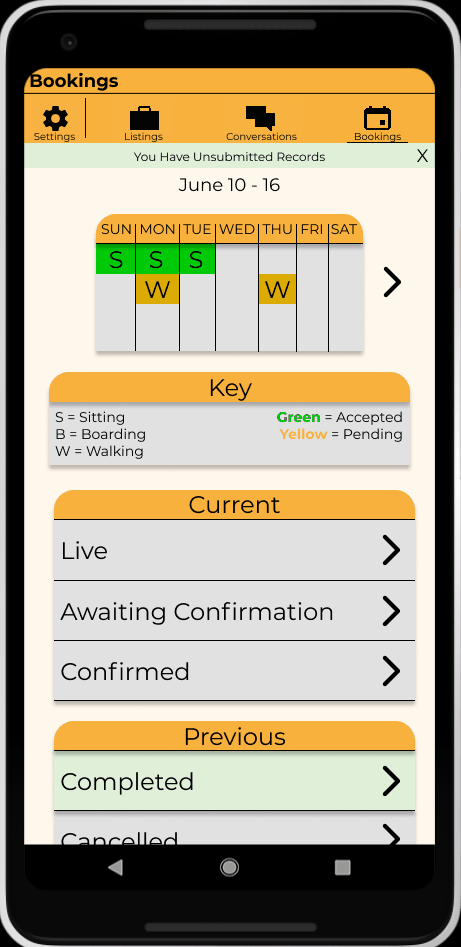
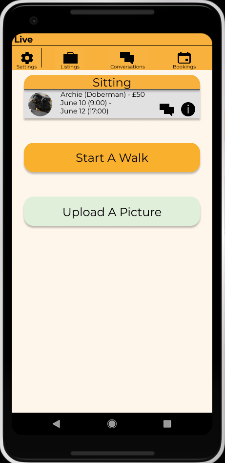
Upcoming, as well as past bookings, can be viewed in list format in the relevant sections. Tapping on the live section brings up what animals are being cared for that day. The user is given a brief overview of the booking information (the type, dates and price). From here the user is also able to quickly pull up the information of the animal such as emergency contact information in the event of an incident, as well as linking to the conversation with the owner. The advantage here is in the event of multiple bookings, the user can navigate in the shortest amount of time to the correct relevant information. There may be instances where there has not been recent communication with a particular owner, and the user has been in contact with multiple owners since. Instead of having to trawl through multiple entries on the “Conversations” tab, the user is able to navigate to the correct owner quicker through the proposed implementation. An example where this would be useful to the user is in a recurring booking, no communication through the app’s conversation section may have occurred since the initial booking – meaning that those messages will be burried, thus cause inconvenience to the user in attempting to hunt down the relevant conversation.

A user can upload a picture or multiple (only a single image can be uploaded at once with the current implementation) as well as start a walk.
When tapping on “Start Walk” a pop up box appears with a selection of animals to choose from. This enables the user to walk multiple animals simultaneously, a feature not currently present. The map will be blurred until 2 conditions have been fulfilled, the first is that a lock on the users location has been found, and then followed by the interaction confirming the start of a walk. Through implementing it this way, it communicates visually to a user that action is required. Having the “Start Walk” in the centre of the screen ensures that a user does not start a walk without setting the app to log it. The current implementation of the app places the “Start Walk” button at the bottom right of the screen, where a user can accidentally overlook the button and believe that the walk is being logged, when in actuality it is not.
In the top left hand corner is a list of the animals which were selected for a walk. There are pull out icons with the options to indicate what type of toileting activity has taken place for a particular animal, providing potentially useful information – e.g. does the owner need to take the dog for a walk straight after being picked up, or in several hours / next day to relieve the animal? This feature is absent in the current app. At the bottom of the screen the distance covered as well as duration are displayed, with the ability to end the walk highlighted in red. A confirmation is displayed when a user taps “End” to ensure that the user does not accidentally and prematurely end a walk. Upon confirmation the user is sent to the conversations tab, and if only 1 animal was selected, taken to the specific owner. A time stamp with distance and length of walk is produced along with toileting information. Both user and owner can review the walk – this is helpful for the user, as a means to manage their time effectively, e.g. a walk was done 5 hours ago and therefore another walk should be initiated within the next hour. For the owner it is useful to ensure the correct amount of exercise, or agreed walking time has been met.
Processing payments are now done within the app instead of requiring the user to navigate to the main website via a browser. A closable banner displays as a reminder when a user has payments that can be processed. The “Completed” bookings box highlights the same colour as the banner to emphasise this key information. Upon tapping the box any unprocessed payments will be displayed at the top, with other completed bookings further down and split into categories. A banner displays how to process the bookings to receive payment. Details of what will be processed are displayed, e.g 3 days boarding at a total of £50. Upon selection and tapping the “Process” icon, a message will appear confirming to the user that their selection has been received. A notification will then be displayed showing when they can expect to receive payment.

Closing Statements:
In all, this redesign should enable a user to quickly and efficiently reach their goal. By allowing there to be multiple paths to reach information on both the pet and owner, this makes getting urgent information into the hands of the user easier should the worst happen. Allowing the user to bring up previous conversations with the user and owner from the bookings section, makes retrieving information quicker. Also by linking back to this, there is the possibility to then view the original advert(s), where the original price agreed was stated - along with the original accompanying information about the animal which might be omitted on the animals profile. By implementing a calendar the user is empowered, by allowing quick visual confirmation of their week and future schedule. Allowing the user to enter in toilet breaks for the animals allows both parties to manage their time and plan more effectively. Notifications serve as both an alert to newly posted adds - and in turn more revenue for the user, as well as reminders on upcoming accepted jobs. Minor annoyances such as filters resetting have been addressed. The user is able to be notified of new adverts, enabling them to maximise their potential clients. Finally integrating the payment system within the app streamlines the process for payments, reducing the hastle of switching from the app to a browser.