Intro:
This is a lo-fi mock up of a feedback form that can be implemented in an app. This is directed to apps which can have their sections broken down into individual pages, such as having; a calendar, messages, duties etc.
The wording was specially chosen to be able to be understood by non-native speakers, having an understandable, unambiguous keyword. This also makes looking at them at a glance easier to understand what is being asked of the user.
The idea was to try and capture as much information in as little amount of time as possible. So the key areas for feedback were boiled down to just a few words. The end goal is to find out which screens within the app should have the most resources spent on them.
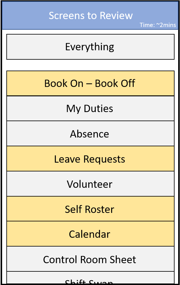
When user feedback is triggered, the user is first presented with the list of screens to review. They are able to select certain screens or to chose to give feedback on all screens. In the top right hand corner an estimated time to completion is given. This forewarns the user of the level of investment they will have to commit in giving feedback.
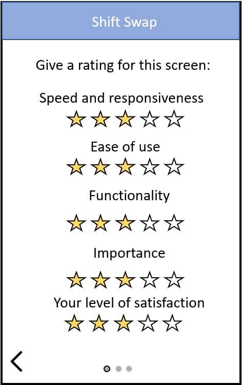
The first of the feedback screens, is designed to capture the overall user experience of a particular section within the app. Included was a measure for level of importance. From this it can be inferred that even if the screen is slow or difficult to use, if its importance is low then resources can be directed elsewhere.
Stars were chosen to represent a likert scale from 1-5. In this way it is easy to communicate visually, the scale and meaning to be inferred from it.
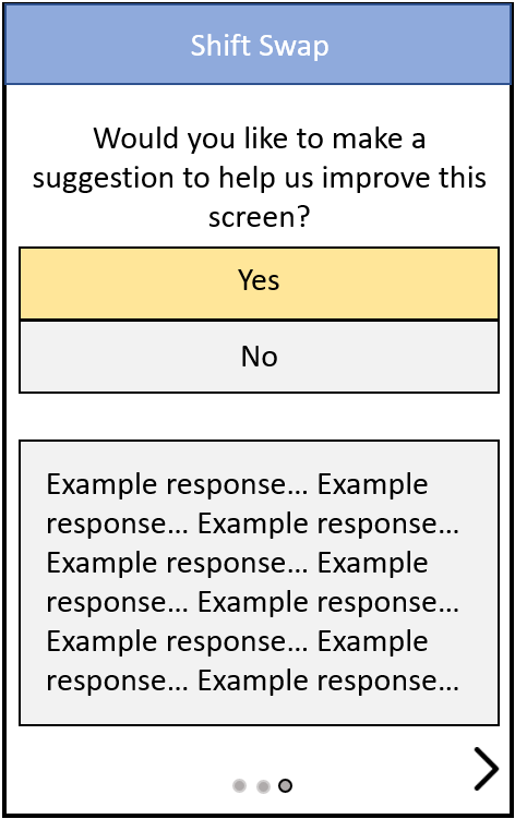
The arrows at the bottom of the screen allow for navigation backwards and forwards on screens. There is an indicator at the bottom (the 3 dots), which tell the user how far along they are in the feedback for a section. This should help communicate that there are only 3 screens to fill out for each selected section for review – in the hope that this will encourage the user to complete feedback.
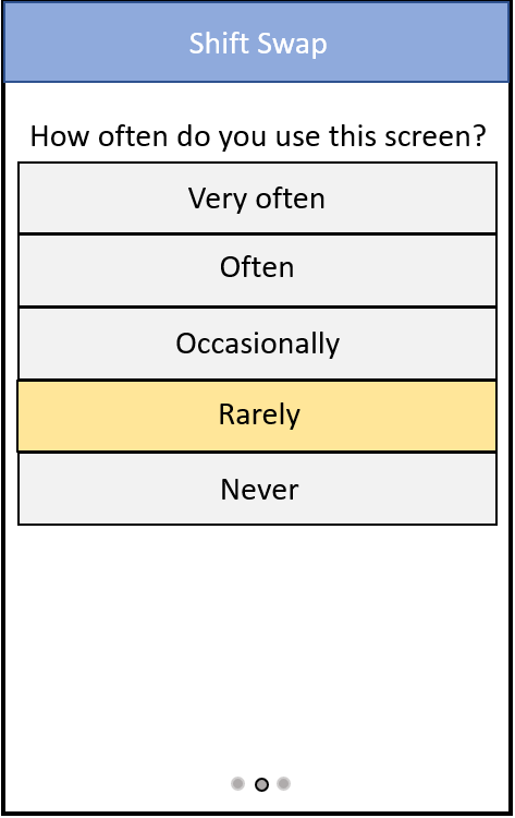
The next screen is used to find out how often a particular user, or group of uses use that specific part of the app. Again if usability is poor but they never use that screen, then resources can be diverted to areas which are used more often.
Next there is a free entry field that is activated if the user answers Yes to giving a suggestion. This can help capture more actionable data, by helping flush out grievances which might not be apparent from the quantitative likert scales used.
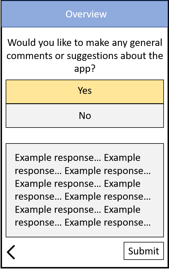
Before the end of the users feedback, the user is given the opportunity to give general feedback. This again is in a free entry field. On this page they then tap on Submit to confirm their feedback which is then sent to the app development team.
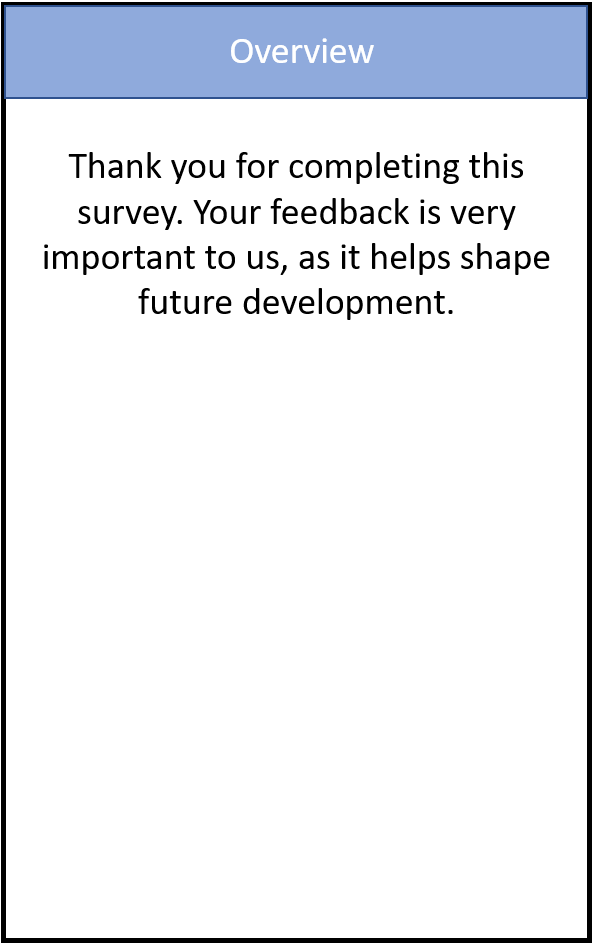
Lastly a thank you page is presented thanking the user for their time.